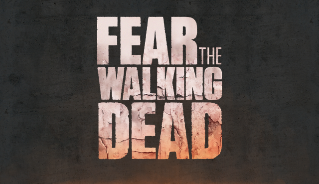
AMC has quietly rolled out an updated Fear the Walking Dead logo on their official site for the show. They’ve changed the layout a bit and added a really gorgeous cracked paint/concrete texture to the top of it. Here’s a closer look (click for a bigger size):
If this ends up being the final logo for the show, it’ll be interesting to see if this already very damaged image will be deteriorating each season like the TWD mothership logo.











Not a fan of the title, never sat right with me…seems to take away from The Walking Dead…for a companion series it should have had a different title. Something to Fear would have been better…IMOBut I am still gonna watch it
I’m with jojodesca on the title itself. As for the formatting, keeping it very similar to TWD definitely works! A big plus if it deteriorates over time.
Still not sold on the idea of the whole thing, tho. The more I read about it, the less enthused I become. But, it is a by-product of TWD, so I have to at least check out the 1st 3 eps.
. . . and then be hooked and left wanting more . . . !
Well, you know what happened when my pessimistic ass went into TWD’s beginning! It got SPANKED!
The General of Lust heard the word Spanked and forgot what he was going to type (yep just referred to myself in the 3rd person) 😉
I knew that would appeal to a man of his caliber (3rd person is the only way to go for The General of Lust).