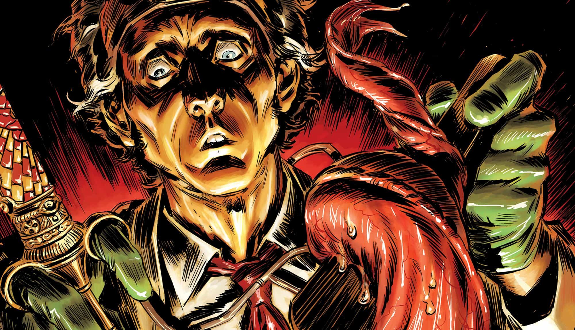
To celebrate this week’s release of WITCH DOCTOR: MAL PRACTICE, we’ve brought artist Lukas Ketner back to share the process behind the first cover. Take it away, Lukas!

1. Typically, I send over around 2-3 possible cover ideas to start the discussion. In this case, we decide that the one on the left has the most promise, so I revise it into a better composition. In this case, the tongue needs to be more prominently curled around the tongue depressor, not breaking it like in the first drawing.

2. This final thumbnail sketch solidifies the direction. This image, even though it’s rough, will be the skeleton for the pencils and final inks. I scale this up on Photoshop and make the layer transparent so that it’s barely visible before making a tighter drawing on top of it. Small sketches like this are crucial for nailing where things rest on the page, so if you compare this to the final cover, you’ll see things haven’t shifted much.

3. Onto the final drawing! I check in with writer Brandon Seifert and editor Sean Mackiewicz to make sure that this is on the right track, then sit down to add some color —

4. — aaand I blow it the first time around. Too much purple, too murky, try again.

5. After another go at the coloring, this one is looking ready to go! If I turn this in with a suggested logo color, I keep it separate so that Skybound can adjust the layout before printing.
That’s it! Hope you enjoyed getting a look at how we put these together.
Lukas Ketner
WITCH DOCTOR: MAL PRACTICE #1 is in stores now!


