Recently ELIZABETH BREITWEISER, the colorist on OUTCAST BY KIRKMAN & AZACETA, did an interview with the Idle Class about Outcast, her process, and more! Check out a snippet of the interview below:
TIC: Obviously Robert Kirkman is one of the biggest names in the comic book industry today and that means “Outcast” was a very hotly anticipated title. How did you come to work on it?
BREITWEISER: He contacted me out of the blue one day and asked if I’d be interested. I believe he first became familiar with my work through a series I colored at Marvel called Captain America and Bucky (with writer Ed Brubaker and artist Chris Samnee). I am a huge “Walking Dead” fan, so of course I was thrilled to hear from him. The pitch sounded fantastic and it was in a genre I had never had the opportunity to work in before. The icing on the cake was illustrator Paul Azaceta. There was no way I could pass it up!
How would you describe “Outcast” to someone unfamiliar with comic books?
Outcast would be a great first read for someone unfamiliar with the comic book medium. A new reader can pick up Outcast and enjoy it right away without having to know any back history like you typically do with classic superhero comics. “Outcast” itself is a story centered around a young man named Kyle Barnes whose entire life has been ruined by demonic possession. When you first meet Kyle, he is at absolute rock bottom. With nothing left to lose, he embarks on an epic journey to fight back and find answers. What he uncovers could bring about the end of life on earth as we know it.
How is working on “Outcast” and with Paul Azaceta different than your previous work?
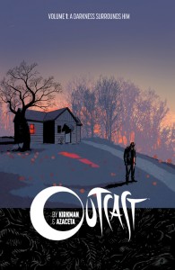
I’ve never quite worked on a book like “Outcast” before. Story wise, this is my first time to work on a full-blooded horror comic, and art-wise, it’s my first time to be able to work in a more graphic style of coloring. These two aspects allow for impactful, moody, disharmonic color
theory, and I’m having a crazy amount of fun experimenting. One other thing that’s new to me is Robert and Paul’s use of micro panels. These are just tiny little insets that highlight the expression on a character’s face, or create focus on some other detail going on in the scene that the reader might otherwise overlook. These micro-panels really serve to add a heightened sense of awareness and atmosphere to the page, and allow me to use little punches of color for storytelling in interesting ways.
As a colorist, does it necessarily require a different approach than say a traditional super hero comic book?
It all depends on the writer and artists a colorist works with, but I would say that independent comics like “Outcast” allow for a bit more freedom to experiment and play than what’s allowed at Marvel or DC. Coloring traditional superhero books can be somewhat restrictive in the sense that you have to work around preset colors for characters/costumes and sometimes settings. There’s also a “house style” that you can’t typically stray too far away from. Though, for the record, Marvel did let me experiment a lot and get away with stuff out of their norm.

What is your favorite thing about working on “Outcast” thus far?
The anticipation of reading each new script and receiving fresh pages! I am genuinely hooked on Robert’s skillful and character-driven writing and Paul’s moody and atmospheric artwork. It’s like having little presents pop up in my inbox, and my nerdy colorist brain gets so excited to put together the pieces of the color puzzle.
And if you want to see her work in action, you can buy Vol. 1 of OUTCAST BY KIRKMAN & AZACETA here!













Comments 1