Last week we showed you what it takes to go from sketch to fully realized cover for THIEF OF THIEVES. This week, we asked HORIZON writer, Brandon Thomas, to share with us some thoughts on the first covers for the series, drawn by Jason Howard (Who, in addition to killer HORIZON covers, draws TREES and SUPER DINOSAUR). We’ve also got your first exclusive look at the cover for issue 6! See what Brandon has to say below and let us know which cover you like the most in the comments.
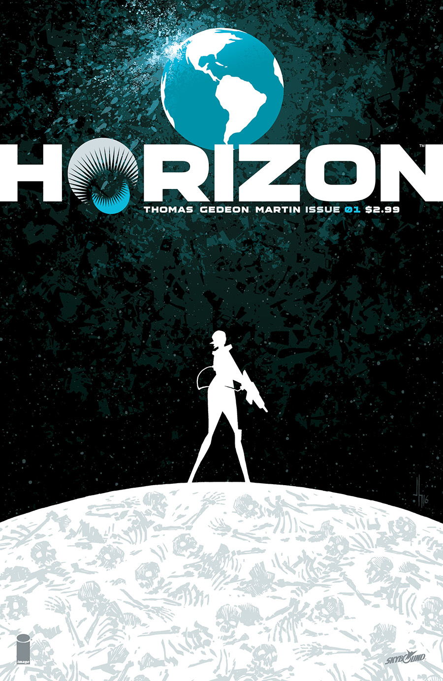
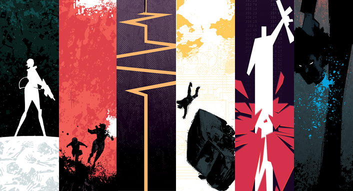
Brandon Thomas: It took us a while to get this one just right, but what we landed on exceeded my wildest expectations. The name that instantly came to mind when Jason Howard’s first sketches came in was Saul Bass. Cool, angular, sexy, and abstract weren’t words I imagined describing the covers for Horizon, but it seems like the most natural and obvious decision in the world now. This is an unconventional book with a premise and cast to match, and it needed something like this to really grab people’s attention and force them to dive into the glorious art by Juan Gedeon, Frank Martin, and Rus Wooton.
Since it’s the first cover, this will likely be the defining piece of promo artwork for the series, and it’s somehow simple and enormously complex at the same time. One woman against a world, armed with almost nothing but her own self-righteousness, standing on a planet of the dead with a survival state of mind. It tells you everything in one image, but it doesn’t explain it, which is our job once Jason has convinced you to crack open the comic and peek inside. Once we get to the point where this is getting blown up on posters, or on the side of the Skybound booth at shows, it’s going to be serious emotions all around.
But this got us off to an excellent start, didn’t it?
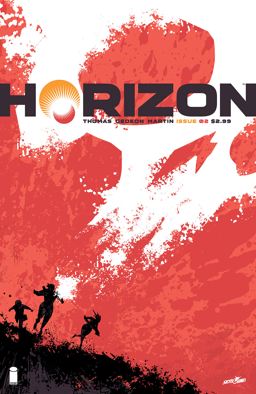
Brandon Thomas: Love, love, LOVE this cover, and it’s a clear reminder to never leave a good idea behind. A few of the roughs for #1 included a subtle skull shape resting on the image of Earth, but it seemed one tiny detail too many. So instead that idea mutated and exploded into what Jason delivered here, and I’m sure we can agree that it’s again amazing. Projecting the skull into the sky and contrasting that giant, ominous image over our smaller main characters gives this cover a cool double meaning. Does the skull refer to their adversaries on Earth, and the fact they’re hopelessly outnumbered and somewhat in over their heads, or is it more a subtle projection of their own will and intentions to tear our world down around us? Love stuff like that.
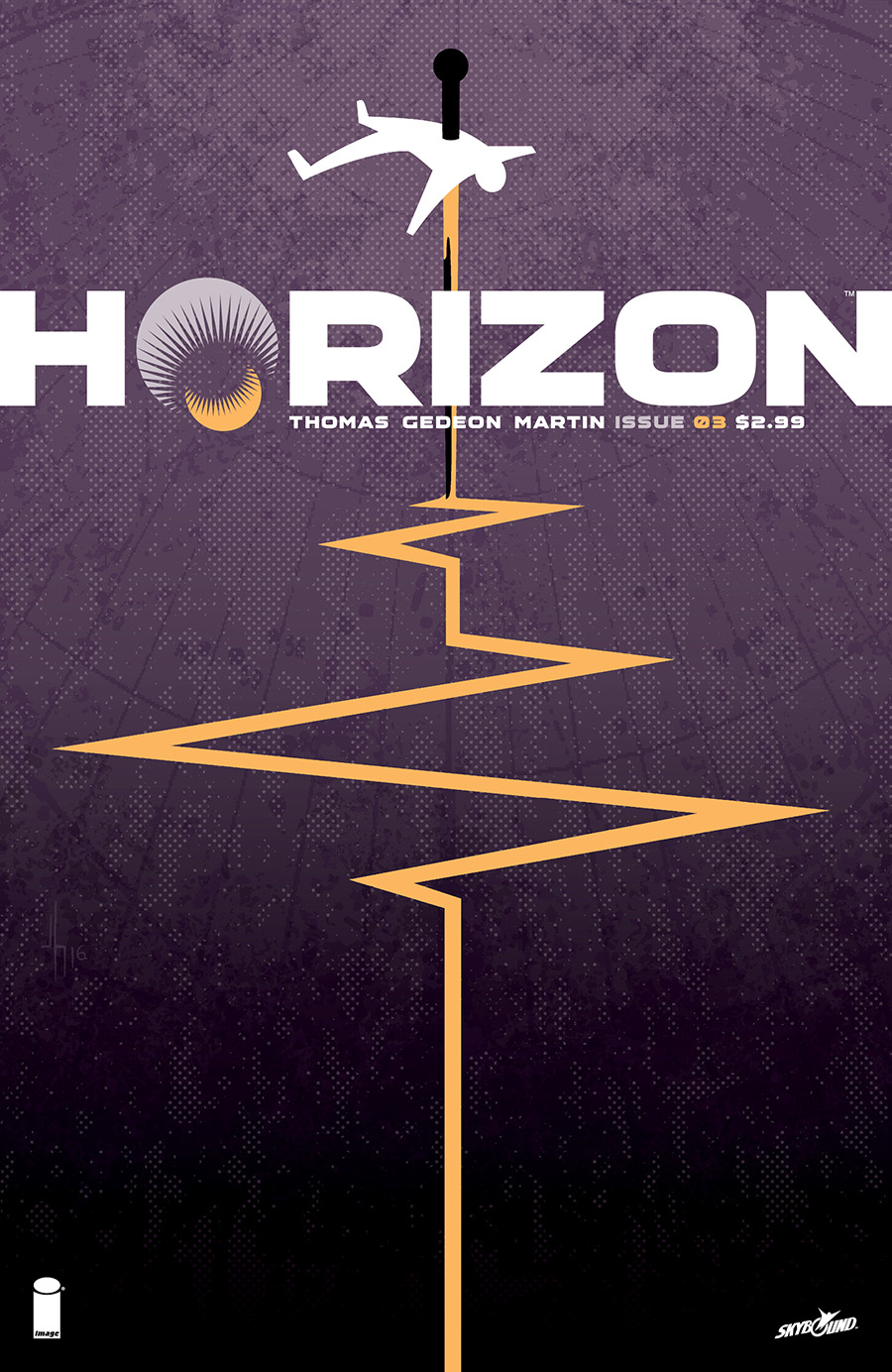
Brandon Thomas: I call this one “needle point” in my head, and it just makes me feel bad for some of the punishment heaped upon one of our main characters. Someone had to draw the short straw, and it’s definitely Finn in this case, so expect this image and the moments it’s alluding to to become an even larger aspect of the book going forward. His ordeal while captured by Earth’s forces changes the entire dynamic within the group, how he views himself and his team/family, and a host of other dramatic shifts. Every time I look at this cover what I really feel is dread, because the worst is not even close to here. Mild spoiler for this issue: major, major villain steps onto the scene for the first time.
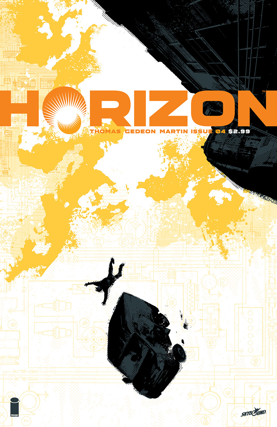
Brandon Thomas: Another great image that can be “read” a few different ways. Is that a massive cloud up in the sky there, or a booming explosion? However it feels or looks to you absolutely works, and the circuitry filling the background is yet another nice detail that suggests something, without telling you outright what it really means. Big idea we’re always playing with in Horizon is that “nothing is as it seems,” and Jason keeps turning in covers that operate on multiple layers. More lovely work.
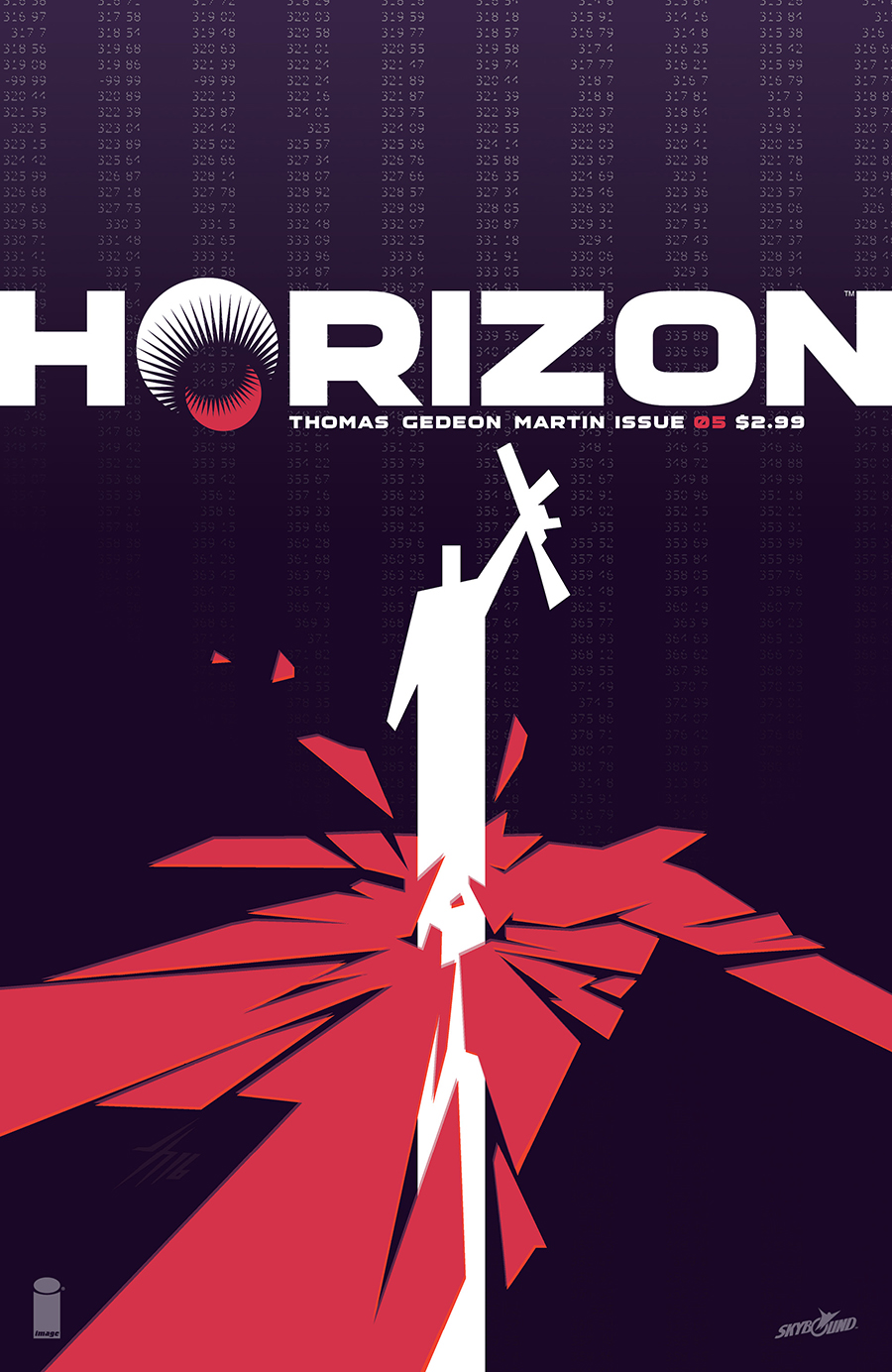
Brandon Thomas: Tide begins to turn here, and after getting separated, captured, beaten up, and chased around, our Valian insurgents begin to land their first solid blows. We’ve talked about propaganda ads and recruitment posters a lot, and this has that kind of feel to me, something triumphant and overly confident. We played with a couple different color combinations, but the white figure looked particularly striking coming through the red. Also, really love the purplish background and the scrolling text, which gives us another great bit of texture and provides a subtle clue to what’s going down during this issue.
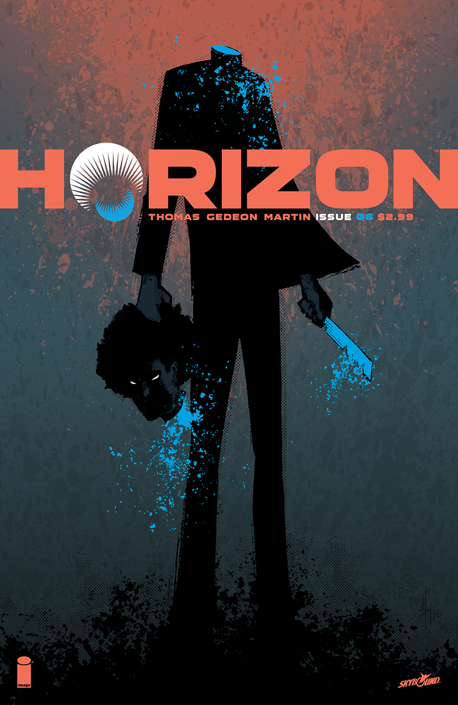
Brandon Thomas: Can’t say too much about this one except that it’s my absolute favorite thus far. This came from another brilliant sketch by Jason, which was almost used much earlier. We decided to hold it back for a few reasons, most of them major spoilers, but ultimately because this is the end of our first arc and we wanted to end it with a serious bang. Everything about Horizon #6 is monumental and epic, and it’s by far the best issue yet, so it deserved a cover that raised eyebrows and demands to be picked up off the shelf. Just don’t skip to the end!










I am loving this series so far. Keep up the great work. The covers are awesome and I will be framing the first 6!