Ever wondered how a cover evolves from idea to reality? Well, lucky for you, Joshua Williamson (writer/creator of BIRTHRIGHT, GHOSTED, and NAILBITER) is here to walk you through the process of creating the epic BIRTHRIGHT #1 cover. Take it away, Josh!
Whew, this cover went through a long process.
Issue one covers can sometimes be the most important thing you do for a book. It’s what retailers see in previews, it’s the first things customers see as they walk into shops. You want to create an image that will grab people, make them want to pick your book up off the stands. It’s a extremely difficult thing to get right.
With most comic covers it’s just a preview of what happens in that issue, that isn’t the case with issue ones. The first issue cover also acts as a preview of the whole series. It’s a visual representation of your mission statement. And because we have have such a big story with Birthright we struggled with creating this cover.
The real challenge was that we wanted to give examples of both the real and fantasy world, and we wanted both young and adult warrior Mikey on the cover. But we didn’t want them on the same plane. Also, we wanted to give the impression this wasn’t your standard run of the mill fantasy book.
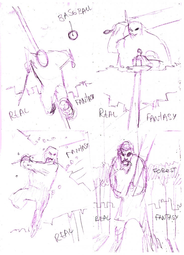
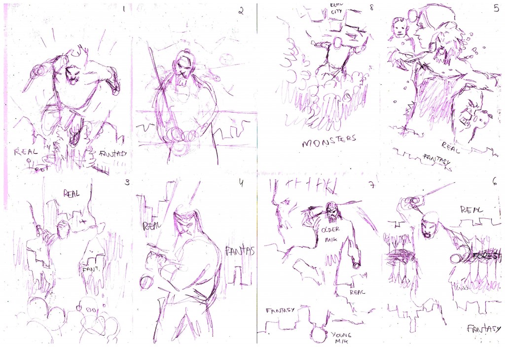
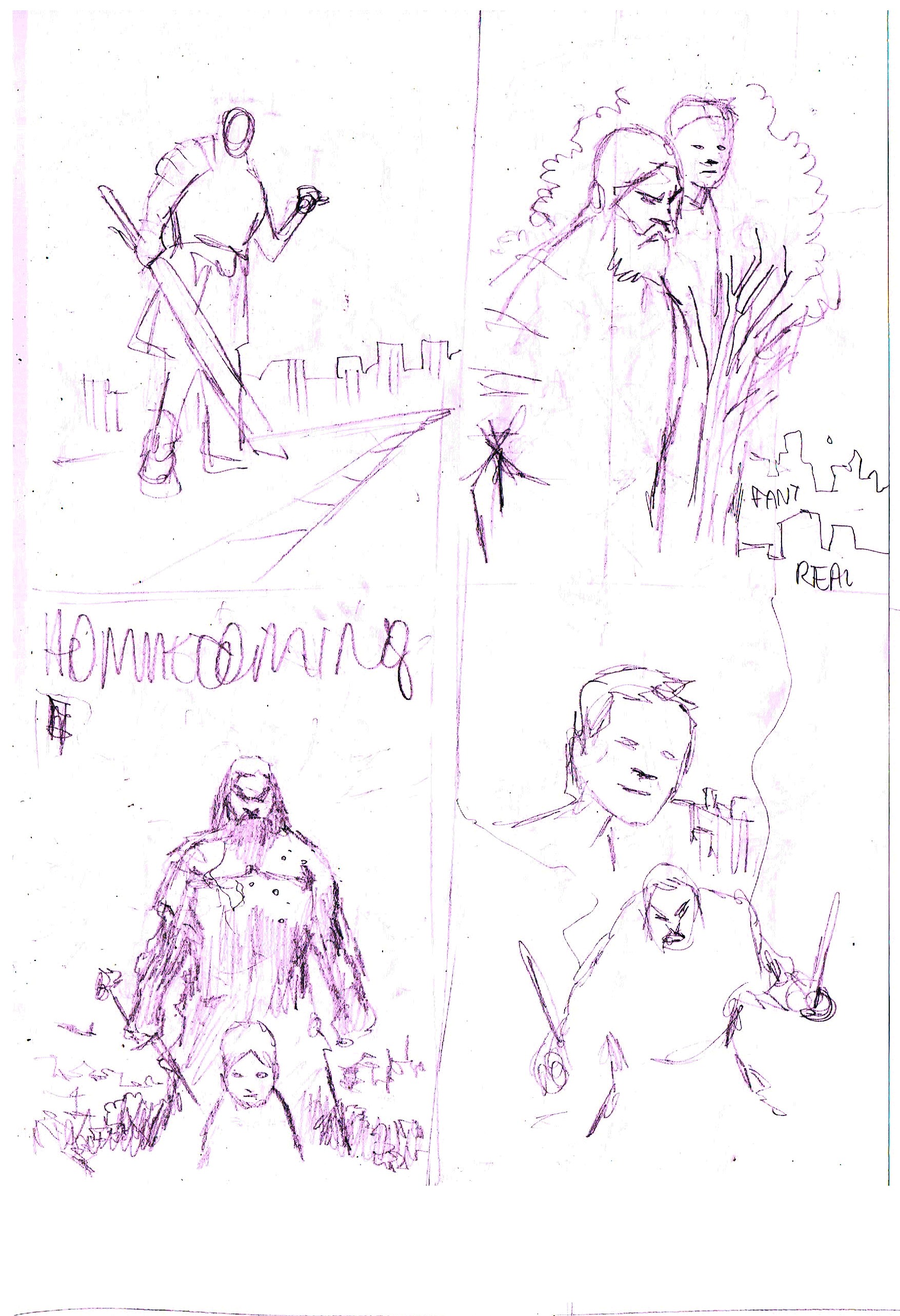
You’ll see in Andrei’s initial roughs we had a lot of focus on Mikey being a bad ass with the sword… but this just wasn’t that kind of book. Eventually we started to get young Mikey in there and calm the warrior version down. Less yelling and sword play.
We started to talk about how this was a epic drama and we needed a cover that fit that description.
And trust me… there are many more roughs, cover designs, and ideas than what we are sharing here.
A conversation we’ve had a lot of is the ideas of “the chosen one.” How it’s used in media, real life, religion, the heroes journey and the symbolism there. It was there that we started to play around with the idea of hinting to the twists in the book. The hidden danger in adult Mikey.
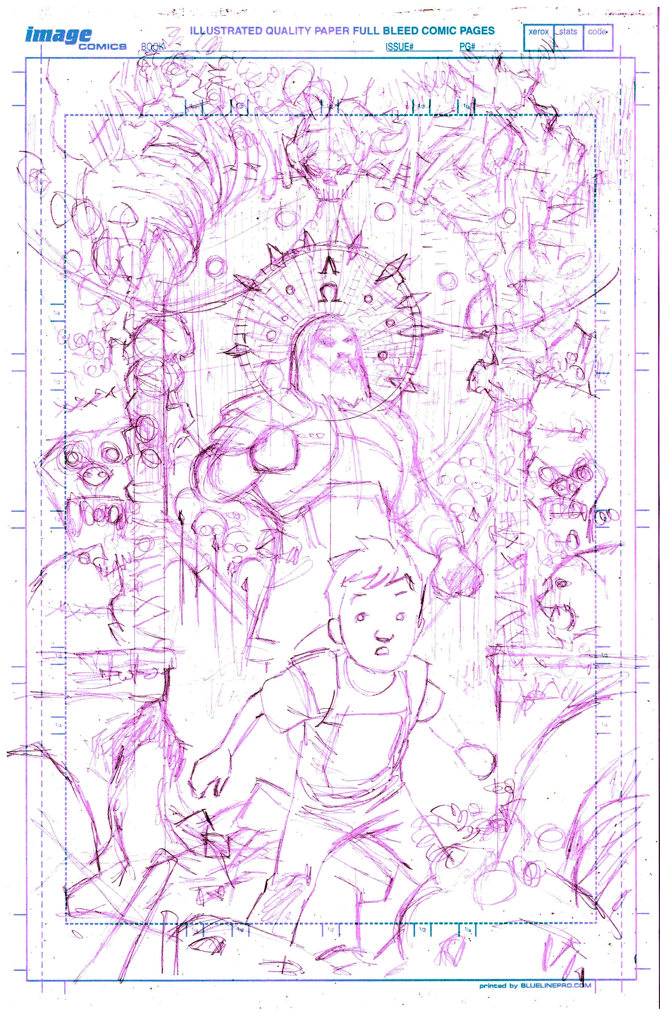
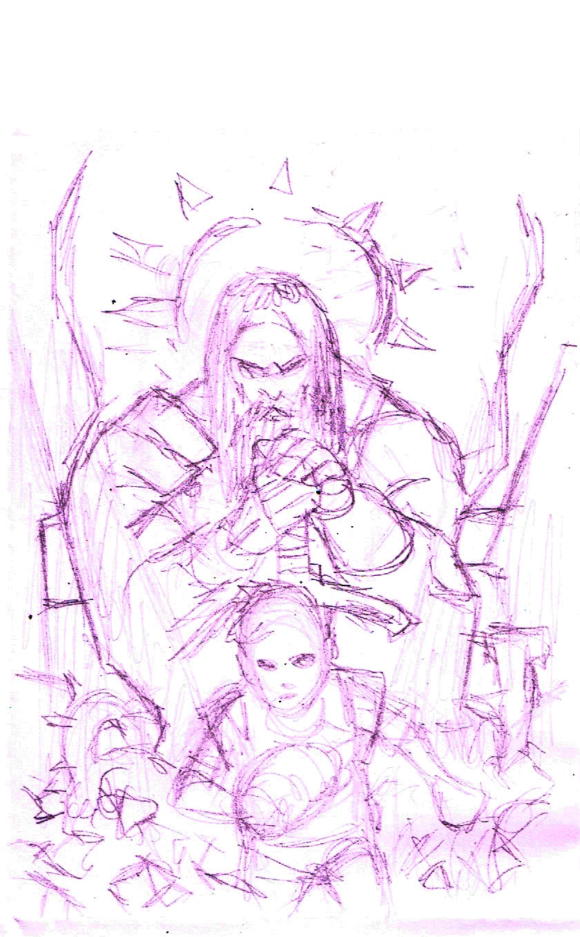
Here is when it started to take shape. I had this idea… Mikey as the chosen one is a prophesy, right? What if there was a painting of a statue, or a carving of that, right? This is what Andrei came back with when I said that. Here we knew were were on the right track.
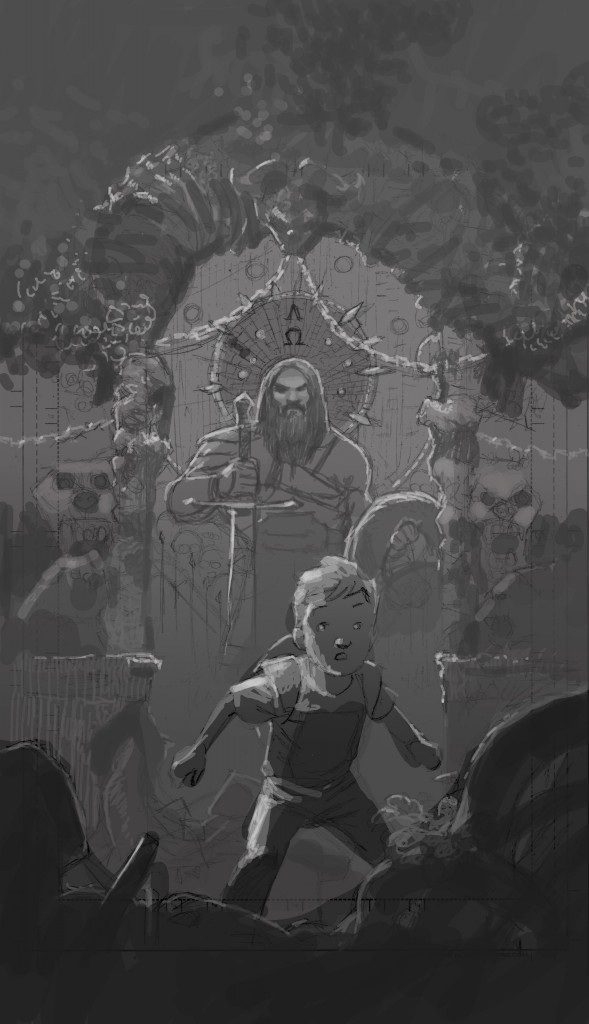
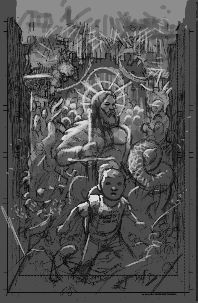
This is were we started to play around with the values on the cover. You’ll also notice some subtle changes to the cover. By this time we were flying.
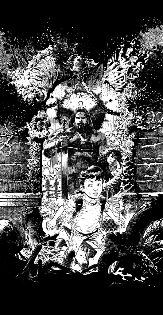
And now the inks. Let me tell you… when I saw this image I was blown away. So much detail. Both young and warrior Mikey look amazing. This is an amazing piece by Andrei that captured everything we wanted.
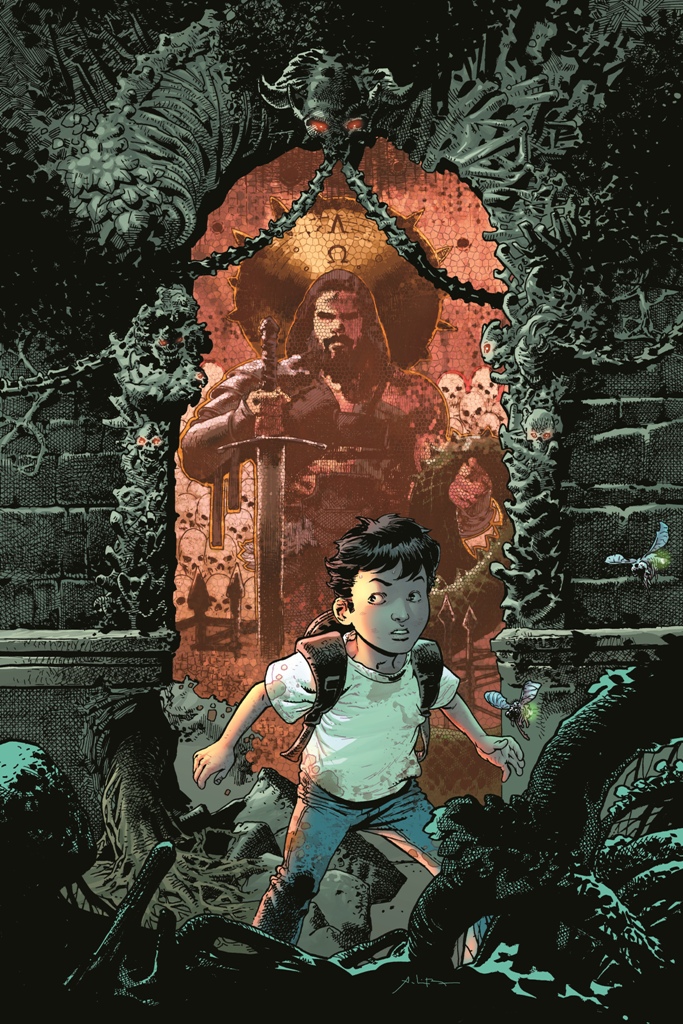
And then Adriano Lucas came in to make it even better! SO GOOD! The colors give that fantasy feel but also help the young Mikey pop off the page.
So let’s talk about this cover for a bit.
You’ll see that Mikey looks like he just arrived in the fantasy world, he has a bit of dirt on him and his backpack and clothes show that he is a modern kid. BUT we see a few giant glowing flies going by, which shows that we are in the fantasy world.
Mikey is also looking to the left at the light source… what is he looking at?! What is over there?! Adventure?! At his feet we see plant life that looks scary to represent the danger in this new world.
You’ll notice that the gateway there is a red eye demon sculpture watching him symbolizing the evil forces keeping an eye on him.
Now we have the painting/carving of warrior Mikey in the background. He is carrying the sword to show that he is a warrior, but he is also holding a snake to show his betrayal. The skulls are behind him to show the ruin he left behind. And the shield behind his head represents a crown making him a king… or a chosen one.
I wish that was all my genius but nope… that’s all Andrei. The guy is a monster and really puts thought into the work. Couldn’t have asked for a better artist on Birthright. He knocked this cover out of the park!
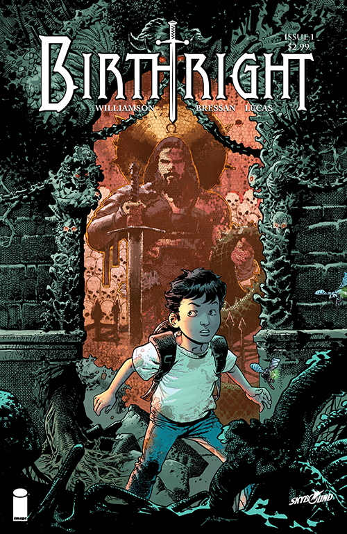
And then we get an awesome logo by Rian Hughes to wrap it up.
Really happy with how this all turned out. It’s the happiest I’ve ever been with a comic book package.









The inked cover looks sweet but goddamn! does it ever pop with the colours.
One of the best comics of the year!
I love seeing the process that artists take when making covers. 🙂